
C L I E N T
Intuit Mailchimp
T E A M
Revenue Retention Team
Experience Design Manager
Product Manager
Engineers
Product Designer
R O L E
Product Designer
WHAT I DID
IC work and UX strategy
Rapid iterations and experimentation
Fostering design x ENG collaboration
Design documentation and ENG hand-off
User research and synthesis
Data informed design
Churn Reduction
BACKGROUND
The pause or delete landing page is the key touchpoint for users to make a decision whether to keep or cancel their Mailchimp account. With a focus on churn reduction, A/B testing was done to learn more about how we can add value for a non-ecommerce and e-commerce business to reconsider their decision to churn.

LEARNING
Based on a variant of the cancelation page that displayed account data and a more personalized experience, it proved to retain high value customers compared to a variant without any.
VARIANT 1 (WINNER + CONTROL)

The account data added to the delete card was effective in reducing churn
-
↓ 1.9% decrease in paid users actively churning
-
↓ 4.8% decrease in revenue actively churned by paid users
VARIANT 2

The lack of personalization, a less compelling banner and reduced valuable information lead to Variant 1 winning
HYPOTHESIS
By further emphasizing account data on the churn page for accomplished users on the Essential, Standard and Premium plan, we will create delightful moments for customers considering closing their account and reinforce the value that Mailchimp brings to their business, ultimately resulting in a lower active churn rate and higher retention.
A P P R O A C H
To build on the winning variant, we brought the account stats to the forefront and disconnected it to the idea of losing all the account data, but instead by celebrating a business's achievements so far, we're encouraging them to continue using Mailchimp for their email marketing. We ran the experiment to high value accomplished paid users to track overall active churn rate and clicks to see the impact on revenue.
DISCOVERY

A quick audit of how account data is presented currently, in what areas of the product, over what time periods helped to understand the current patterns and usage.
Looking through the cancellation flow provided insight into the rest of the churn flow and the messaging.
CONSIDERATIONS
How Might We
Show the value that Mailchimp brings to the business
How Might We
Indicate growth on the churn page to encourage users to keep their account
How Might We
Optimize the page design with account data highlighted
DESIGN SOLUTIONS FOR NON-ECOMMERCE BUSINESSES
Iterations


To highlight the data, iterations for the hero module helped decide how to frame the stats to indicate growth
EXPERIENCE PRINCIPLES TO REDUCE CHURN
1
Amplifying growth
To encourage customers to stay on their plan
2
Positive messaging
By celebrating small wins
3
Visibility of data
For easier decision making and personalization
Final
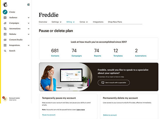

For businesses that have been <90 days on Mailchimp
The landing page celebrates the business's achievements so far, the account data is highlighted in descending order with labels as CTAs to learn more and serve as a redirection
-
If a user has <1 of any of the wells, do not show that well and center the remaining wells.
-
If a user has less than 3 of the wells - do not show the data well section at all.

Documentation and annotation in Figma for hand-off to the Engineers
IMPACT
Comparing the control vs variant:
-
5.48% decrease in active churn among users in the experiment
-
5.69% decrease in churned revenue, equating around ~$15K saved per month
SCALING TO E-COMMERCE BUSINESSES
HYPOTHESIS
By presenting relevant ecommerce data to users with connected stores on the churn page, we will create a powerful reminder of the value that Mailchimp has driven for their business and reduce active churn.
DISCOVERY

A quick audit of the datawells patterns and interactions on the Marketing dashboard, Homepage, Integrations page and Custom report option provided clarity on how multiple stores data are handled and their dependencies.
Iterations


The biggest consideration for e-commerce businesses was how to handle multiple integration partners and display metrics for more than 1 store.
Final
VARIANT 1

Beyond the data, we were also interested in seeing whether customers wanted to take action. We wanted to learn how effective CTAs were as churn deterrents.
VARIANT 2 (WINNER)

If multiple integrations were connected or no coin was setup, the logo would default to a shopping cart icon
Following the similar concept of data highlights, it was rolled out to e-commerce businesses celebrating their aggregate Revenue, Orders and Email open rate to show Mailchimp's impact so far
-
If a user has <$100 in Revenue, do not show that data and center the remaining one's.
-
If a user doesn't have Revenue or Orders - do not show the data well section at all.
IMPACT
Comparing the control vs variants:
-
1.97% decrease in active churn among users in the experiment
-
2.21% decrease in churned revenue, equating around ~$5K saved per month
VALIDATION WITH USER RESEARCH

A test plan with screener q's and tasks was drafted to gauge a better understanding of the usefulness of displaying metrics and which one's add value to e-commerce businesses from keeping their account

5 unmoderated UserTesting sessions were conducted comparing 2 designs for the future vision of the pause/delete page.


By sorting and synthesizing the qual. research, 9 insights and opportunities emerged to build on


LEARNINGS
Key takeaways were:
-
Small changes can have big impact and proof is in the results
-
Before making any major design changes, validating designs with user testing gave useful directional feedback
-
Close collaboration with the engineers was important to maintain the pace of the experiments
-
Won the Growth Experimentation award across Mailchimp for most impactful experiments